微信小程序布局使用的是 Flex,只是某些地方稍微有些变种,下面演示小程序中主要使用到的 Flex 布局。
1
2
3
4
5
6
7
8
9
10
11
12
13
14
15
16
17
18
19
20
21
22
23
24
25
26
27
28
29
30
31
32
33
34
35
36
37
38
39
40
41
42
43
44
45
46
47
48
49
50
51
52
53
54
55
56
57
|
<view class="container">
<view class="flex-section">
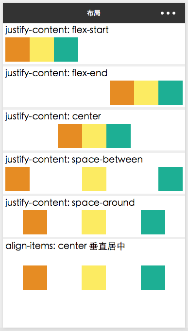
<text>justify-content: flex-start</text>
<view class="flex-items" style="justify-content: flex-start;">
<view class="flex-item bc_red"></view>
<view class="flex-item bc_green"></view>
<view class="flex-item bc_blue"></view>
</view>
</view>
<view class="flex-section">
<text>justify-content: flex-end</text>
<view class="flex-items" style="justify-content: flex-end;">
<view class="flex-item bc_red"></view>
<view class="flex-item bc_green"></view>
<view class="flex-item bc_blue"></view>
</view>
</view>
<view class="flex-section">
<text>justify-content: center</text>
<view class="flex-items" style="justify-content: center;">
<view class="flex-item bc_red"></view>
<view class="flex-item bc_green"></view>
<view class="flex-item bc_blue"></view>
</view>
</view>
<view class="flex-section">
<text>justify-content: space-between</text>
<view class="flex-items" style="justify-content: space-between;">
<view class="flex-item bc_red"></view>
<view class="flex-item bc_green"></view>
<view class="flex-item bc_blue"></view>
</view>
</view>
<view class="flex-section">
<text>justify-content: space-around</text>
<view class="flex-items" style="justify-content: space-around;">
<view class="flex-item bc_red"></view>
<view class="flex-item bc_green"></view>
<view class="flex-item bc_blue"></view>
</view>
</view>
<view class="flex-section">
<text>align-items: center 垂直居中</text>
<view class="flex-items" style="justify-content: space-around; height: 200rpx; align-items: center;">
<view class="flex-item bc_red"></view>
<view class="flex-item bc_green"></view>
<view class="flex-item bc_blue"></view>
</view>
</view>
</view>
|
1
2
3
4
5
6
7
8
9
10
11
12
13
14
15
16
17
18
19
20
21
22
23
24
25
26
27
28
29
30
31
32
33
34
35
36
37
38
39
40
41
42
43
44
45
|
.container {
background-color: #EEE;
}
.flex-section {
width: 100%;
margin-bottom: 10rpx;
background-color: white;
box-sizing: border-box;
padding: 10rpx;
}
.flex-section:last-child {
margin-bottom: 0;
}
.flex-items {
display: flex;
flex-direction: row;
margin-top: 10rpx;
}
.flex-item {
width: 100rpx;
height: 100rpx;
}
.bc_red {
background-color: #E68C23;
}
.bc_green {
background-color: #FCEB62;
}
.bc_blue {
background-color: #1DAF94;
}
|